Big Data Cyber Security
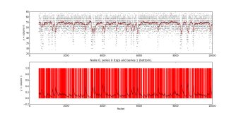
Anomaly detection algorithms can identify the potential malicious traffic patterns entering or leaving on a certain organizations distributive network
Packet anlysis of distributive networks
Distributive Network Anomaly Detection.p[...]
Adobe Acrobat document [781.2 KB]
Adobe Acrobat document [781.2 KB]


